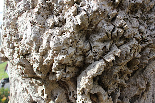
1. The most interesting part of Part 1 of the Texture Project was creating collages of rubbing found around campus. It was both fun and interesting because of the freedom of the task. The types of textures that you rubbed onto the paper and positioning of the rubbings where up to you and how you wanted your paper to look/feel.
2. I feel the most interesting picture I took of texture was the picture of the Turk in the quad. I was intrigrued by the feeling and look of the turf. By laying down, I was able to get a better sense of the texture through all the turf.
3. I believe that my digital collage was the most successful. I think the variations I made to the photos and the tools I used to overlap them resulted in a really good piece. I like the colors formed from overlapping and different shadings. I think I have enough going on in the image to make it interesting and intriguing but not too many photos to where you can't tell what is going on.
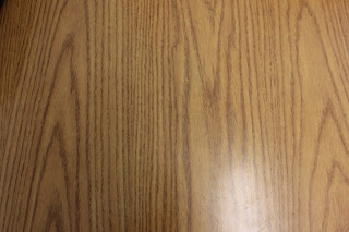
4. My favorite collage is my most successful one. As I described above, I am intrigued by the overlapping photos and variations made to them. I used 2 different leafs at the top of the collage. For the background, I mixed together a photo of the ground in the art room and a table in the digital lab. The colors and textures blended well together. I also used a picture of the uneven concrete ground. I faded this image more and overlapped it with other pictures in the collage to create cool colors that I think makes the collage better.
5. Techniques shown by Mr. O will definelty help in the transformation from a 2-D collage to a 3-D collage. Plaster will help a lot to form difficult textures as well as clay. I also need to remember to make the texture backwards in plaster to create the correct image when it is flipped over.
Monday, December 12, 2011
Monday, November 28, 2011
Color Unit Reflection Questions
1. How did you develop your craft with these projects? What tools, methods and materials were essential to your success with these projects?
- To start to create these paintings, acrylic paints were used for this project. Different colors were used for mixing and shading in the various paintings. Different thickness of brushes and different brush strokes were used to create both a sense of depth in the paintings and to create different feels the paintings portrayed. Also, the color wheel was looked at to understand the colors that needed to be used for the different color strategies. In the Color Mixing project, we used cameras to take the pictures of different color schemes such as complementary and monochromatic. Then we used iPad's to create colormixer images that reflex the colors in the pictures taken.
2. How did you use your skills of observation with these projects? How have these projects taught you to observe color?
- Observation was necessary in the project to notice the shades of the picture that needed to be expressed in the painting. Different depths in the picture translated into different shades of each color in the painting. In the Color Mixing project, you needed to notice and sometimes change around the colors in pictures that were taken. When you made the colormixer image on the iPad, the colors in the picture were copied onto the colormixer image to show the colors throughout the image.
Monday, October 24, 2011
Tuesday, October 4, 2011
Contour Drawings
For this contour drawing, I used fruit for the drawing. There was a banana, pear, apple, and corn. I focused on creating shape and depth to the fruit.
 |
| I used a leaf from outside the room for this drawing. There was a hole in it from a animal or insect. I focused on the detail of the lines inside the leaf. |
Rayogram Picture- Dark Room
For my rayogram, I used pens and sharpie to surround leaves. There is no symmetry but the pens kind of have a relation to each other. I like how the pens surround the leaves and create the feeling that the pens are boxed in.
In the dark room, you had to first create your rayogram by placing the objects on paper before turing the light on. After the objects are in pace you turn on the light which captures the objects on the paper. Then you put the paper in developer for 2 mins, stopbath for 30 secs, fixer for 4 mins, then water, primawash, then water again. After the process you leave the rayogram to dry. Over the course of the process, you can see the rayogram start to show up on the paper.
I think I excelled at developing the craft because I followed the process to the rayogram well and the piece turned out well and the boarders of the rayogram are pretty good. I struggled a little with envisioning the picture and I like my picture but I think i could have come up with a cooler or much more interesting image.
Friday, September 30, 2011
Cut-Out Collage
This collage was under the category Directional Movement and I thought the circles/balls getting smaller and smaller in the distance represented the category. I also thought the movement of the batter hitting the ball and following through shows the movement of the piece. I adding the ground to add some positive space in the piece so there wasn't too much black.
This piece was under the category Harmony because I tried to make the piece symmetrical and with the inorganic shapes. The circles in the middle filled negative space and showed the flow of the piece going upwards.
Subscribe to:
Posts (Atom)


